Monday, July 21, 2008

CARTOGRAM

This map is a cartogram using population as the variable to determine the size and shape of each county in the Contiguous U.S. The distorted result is overlaid with outlines representing the actual size, shape and location of each county. This is a pretty abstract illustration of the U.S. but it certainly gives you a good picture of how the counties compare to each other in population.

Link to website source:
http://issrweb.asu.edu/services/gis/sample-maps.html

Thursday, July 3, 2008

FLOW MAP


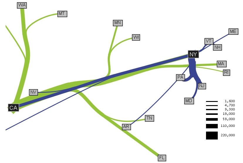
This flow map shows migration from other states to California and New York. The flow illustrated by this map reflects more people moving from the East Coast to New York while California attracts people from more geographic regions across the country. It looks like the widths of the lines are in proportion with the larger or smaller number of people migrating from specific places. I would like to see this diagram or some version of it over laid on a map of the US so you could get a better idea about distances.


Link to website source:

http://graphics.stanford.edu/papers/flow_map_layout/


ISOLINE MAP


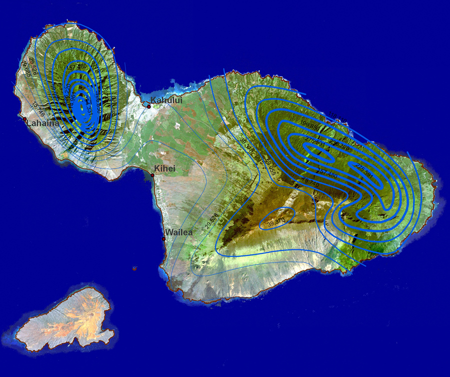
This is an interesting isoline map from an article published by ESRI about how GIS is being used in education. The isolines represent rainfall ranges in Maui, Hawaii and they are laid over a Landsat image. The range is drastic in some areas and this jpg really demonstrates the affects of rainfall amounts on land cover and use. It is an amazing illustration of how climate impacts the surface of the earth. The isolines just seem to highlight the areas of changing vegetation and color.

Cool map!


Link to website source:
http://www.esri.com/news/arcwatch/0207/feature.html


PROPORTIONAL CIRCLE MAP


This map is an example of a proportional circle map showing population by mother tongue for provinces and territories in Canada. The source is Statistics Canada dated 2006 and the green circles represent a specific number. The size of the circle is relative to the size of the population where a smaller circle symbolizes lower population and a larger one, greater population. This website has a learning resource called E-STAT which is an interactive tool about society and the economy in Canada. Access is free but only available to educational institutions. The map I found is just an example of the mapping tools they offer for analyzing trends across geographic regions.


Link to website source:

http://www.statcan.ca/english/Estat/guide/census.htm


Friday, June 27, 2008

CHOROPLETH MAP


A choropleth map is defined as a thematic map in which areas are shaded or patterned in proportion to the measurement of the statistical variable being displayed on the map. This one shows alcohol related fatalities by county in Massachusetts for 2006. The legend reflects a range of the number of fatalities in each county. I think this is a great map for communicating these statistics and the website actually has lots more information including maps for all states.

Link to website source:
http://www-nrd.nhtsa.dot.gov/departments/nrd-30/ncsa/STSI/25_MA/2006/25_MA_2006.htm

Thursday, June 26, 2008

DOT DISTRIBUTION MAP

This map of British Columbia is a dot distribution of the population figures from their 2001 census. I think a little more detail might be helpful to determine the actual location of the more heavily populated regions. The zoomed in areas of Victoria and Vancouver offer a better view but the large map could at least have some cities or something for reference. On this map each dot represents 25 people and they are randomly distributed.

Link to website source:
http://www.bcstats.gov.bc.ca/DATA/POP/georef/thematic.asp

Wednesday, June 25, 2008

PROPAGANDA MAP

Propaganda maps seem very popular during times of war to influence the opinions or behaviors of large numbers of people. This is a propaganda map dating from just before World War II, created by the Nazi-German side. It shows Czechoslovak bomber planes covering all of Germany. The article indicates that they were trying to convince the German public that the Czechoslovak side was responsible for the ‘threat’.

Note: I posted this map in June before the slides for week 11 were available. I later realized it was in them so I have added a different propaganda map at the end.

Link to website source:
http://strangemaps.wordpress.com/2006/12/11/49-czechoslovakia-threatens-germany-1934/