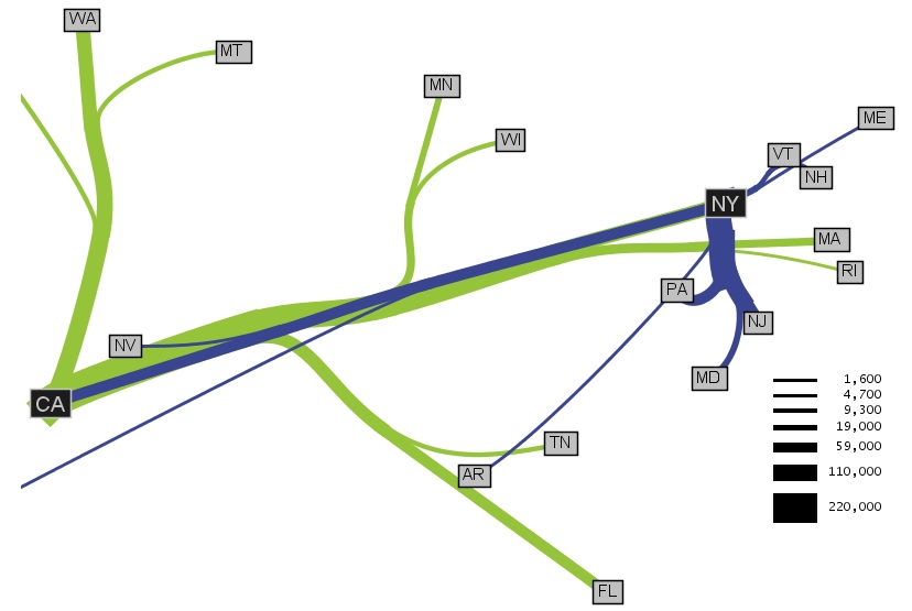
This flow map shows migration from other states to California and New York. The flow illustrated by this map reflects more people moving from the East Coast to New York while California attracts people from more geographic regions across the country. It looks like the widths of the lines are in proportion with the larger or smaller number of people migrating from specific places. I would like to see this diagram or some version of it over laid on a map of the US so you could get a better idea about distances.
Link to website source:
http://graphics.stanford.edu/papers/flow_map_layout/
No comments:
Post a Comment