Wednesday, July 30, 2008
CONTINUOUSLY VARIABLE PROPORTIONAL CIRCLE MAP
http://mapmaker.rutgers.edu/355/links.html
DOQQ
Link to website:
http://www.fireimaging.com/fires/2007/california/colina/253/index.html
DEM
Link to website:
http://map.hamilton.ca/maphamilton/S_Files/aboutimages.aspx
DLG
Click twice on the map to get a large, clear image.
Link to website:
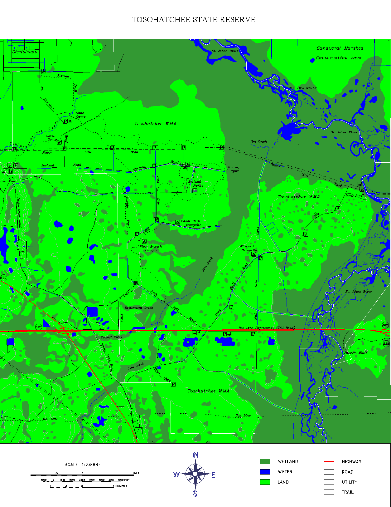
http://www.outintheboonies.com/Tosohatchee/
DRG
If you click the map twice the image is a bit clearer.
Link to website:
http://wgiac.state.wy.us/scripts/DRGMAP/DRGmap.aspx?Area_Type=250K
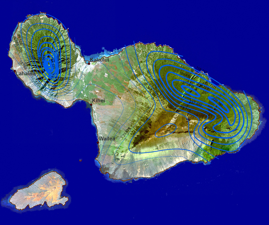
ISOPLETH MAP
Link to website source:
http://nfwatershed.org/templates/System/details.asp?id=40322&PID=490669
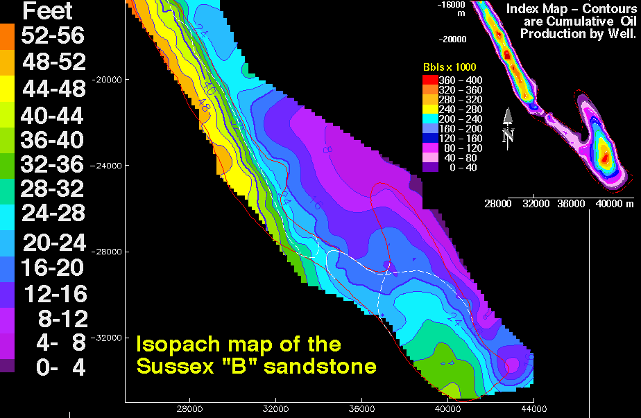
ISOPACH MAP
Link to website source:
http://pubs.usgs.gov/dds/dds-033/USGS_3D/ssx_txt/all.htm
Friday, July 25, 2008
ISOHYETS
Link to website source:
http://soer.justice.tas.gov.au/2003/image/265/index.php
ISOTACHS
Link to website source:
http://www.atmos.washington.edu/~mcmurdie/oct96/oct96_labs.html
ISOBARS
Link to website source:
http://www.bom.gov.au/info/ftweather/page_7.shtml
Thursday, July 24, 2008
LIDAR
Link to website source:
http://imaging.geocomm.com/gallery/
DOPPLER RADAR
Link to website source:
http://www.srh.noaa.gov/tlh/wxevents/alberto061306.html
Wednesday, July 23, 2008
BLACK AND WHITE AERIAL PHOTO
Link to website source:
http://online.redwoods.edu/instruct/colloquium/0607/
Tuesday, July 22, 2008
INFRARED AERIAL PHOTO
Link to website source:
http://www.onlakepartners.org/p1101.html
CARTOGRAPHIC ANIMATION
Link to website source:
http://maps.unomaha.edu/mp/Articles/GISLIS/VisAnim.html
Monday, July 21, 2008
NON STATISTICAL MAP
Note: I originally had this posted as a statisitcal map but upon further study, I realized, by slide definition, this one is not the type.
Link to website source:
http://www.ntia.doc.gov/opadhome/mtdpweb/outline.htm
CARTOGRAM
Link to website source:
http://issrweb.asu.edu/services/gis/sample-maps.html
Thursday, July 3, 2008
FLOW MAP
This flow map shows migration from other states to California and New York. The flow illustrated by this map reflects more people moving from the East Coast to New York while California attracts people from more geographic regions across the country. It looks like the widths of the lines are in proportion with the larger or smaller number of people migrating from specific places. I would like to see this diagram or some version of it over laid on a map of the US so you could get a better idea about distances.
Link to website source:
http://graphics.stanford.edu/papers/flow_map_layout/
ISOLINE MAP
This is an interesting isoline map from an article published by ESRI about how GIS is being used in education. The isolines represent rainfall ranges in and they are laid over a
Link to website source:
http://www.esri.com/news/arcwatch/0207/feature.html
PROPORTIONAL CIRCLE MAP
This map is an example of a proportional circle map showing population by mother tongue for provinces and territories in Canada. The source is Statistics Canada dated 2006 and the green circles represent a specific number. The size of the circle is relative to the size of the population where a smaller circle symbolizes lower population and a larger one, greater population. This website has a learning resource called E-STAT which is an interactive tool about society and the economy in Canada. Access is free but only available to educational institutions. The map I found is just an example of the mapping tools they offer for analyzing trends across geographic regions.
Link to website source:
http://www.statcan.ca/english/Estat/guide/census.htm